FileMaker Pro 9 has another awesome new feature: *Autoresize*. Now your layout elements can stretch their legs when you give them a bigger window. Auto-resize lets you tell FileMaker how different elements on the layout should stretch and move as the window is resized by the user. But it can be a little tough to understand exactly how it works. Here are three tips to help you take best advantage of this awesome new feature.
## First, the Basics
Before we dive into the tips, though, you might need a little up-to-speed on just how autoresize works. In FileMaker 9, every object on the layout has a set of *anchors* that can link it to the edge of the window. You turn these anchors on and off in the Object Info palette (View -> Object Info). You can see the anchor settings in FileMaker 9’s new-and-improved Object Info palette right here:
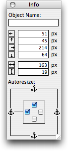
You turn an anchor’s check box on if you want FileMaker to hook that side of the object to the side of the window.
Chances are, if you look at any of your layout objects right now, they’ll all be anchored on the top and left. This is the way objects start out life, and it makes them work just like they did in older versions of FileMaker: no matter how big you make the window, the object stays in the same spot, as though it’s anchored to the top and left edges of the window.
If you turn on the *bottom* and *right* anchors instead, the object will *move* as you resize the window. It will stay the same distance from the bottom and right edges of the window, so when the window gets bigger, the object effectively moves down and right.
Even better, if you anchor an object on *both the right and left* it will actually get *bigger* with the window. Just picture those anchors holding tight to the sides of the window, stretching the object as they go. Of course you can anchor an object on the top and bottom to make it stretch taller. You can even turn on all four anchors to make it grow or shrink every which way.
## Resize Early, Resize Often
Our first autoresize tip is more advice than technique: Use autoresize *practically everywhere*. Even if your users are all in the same office, with the same size screens and nothing better to do on their computers than use your database, it is still worth doing. Once you get the hang of it, it only takes a few seconds to auto-resize-enhance a typical layout. And once you do, you’ve made life easier for your users.
And as you start adding new layouts, think about autoresize from the very beginning. Set anchors as you go, and test windows at multiple sizes.
Of course there are some situations where autoresize is not appropriate. For instance, layouts that are primarily destined for the printer usually have a very specific size and arrangement so things properly fit paper. Autoresize doesn’t make sense for layouts like this. You also don’t need to bother with autoresize on layouts that operate behind the scenes, where scripts get their work done.
> Note: See Nick’s comment below about using Autoresize on printed reports to handle different paper sizes or orientations. I haven’t tried this yet but it sounds like a fantastic idea.
## Set the Width
When an object is anchored on any particular side, FileMaker keeps the distance between the object and that side of the layout constant. As the layout’s edge moves, so does the object.
This begs the question: where’s the right edge of a layout? After all, the other three sides are easy:
– The *top and left* are just the edges of the database window itself.
– You set the *bottom* yourself by dragging the bottom-most part boundary.
But the right edge is a real mystery. It turns out FileMaker decides on the right edge all by itself. It is an imaginary line set on the right edge of the right-most object on the layout.
When you introduce autoresize, this can be a problem. If an object is anchored on the right, and it happens to be the right-most thing on the layout, it has a nasty habit of sliding so far right that it bumps right into the side of the window. Usually, you want a little space between each object and the window border.
If you’re lucky, you have a graphical element on the layout can can establish a better right edge. For instance, you might have a decorative line that stretches all the way across the layout. If you anchor this to the left and right, it will *always* stretch across the window. And since everything else on the layout is a little less to-the-right than the end of that line, they won’t have a problem keeping away from the edge of the window.
If you *aren’t* lucky, you’ll have to set the right edge yourself using a bit of a hack. Just put an invisible line on the layout where you want the right edge to be. (Set its line thickness to None to make it invisible.) This is a lousy solution, but it is the only one that works sometimes.
## Think Small
When you do design with autoresize in mind, keep this in mind too: small is good. Within reason, you should generally design your layouts as small as possible. The reason is simple: FileMaker will never resize an element *smaller* than it is in Layout mode. If your layout is designed large, your users won’t be able to make the window smaller and still see the whole layout.
This takes getting used to. You’re accustomed to designing layouts at an *ideal* size, where each field is big enough to show typical data. As you work on a small layout in layout mode, you might begin to feel like all those tiny fields are ridiculous. “Nobody would ever want to work in my database at this size!” But keep this in mind: they won’t have to. When you design in layout mode, you’re no longer specifying the ideal size. Instead, you’re establishing the *smallest* size. It is reasonable that a layout at its smallest will be a little cramped. Once you switch to browse mode, everything will instantly adapt to a roomier window.
Here’s a layout that’s probably a little too small for regular use:
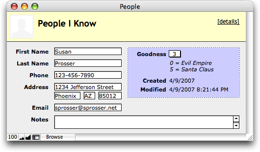
But most users will go ahead and make the window bigger. (in fact, you can do it for them: FileMaker remembers the size of the window when you close and re-open it. And you can always use scripts to set the window size if you’re needs are more esoteric.) Here’s a more normal presentation:
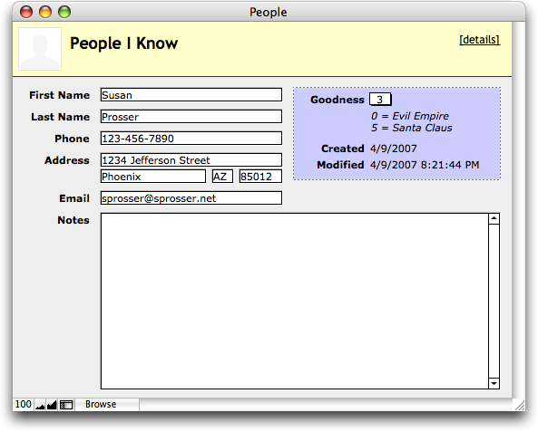
At the same time, when a user *wants* things a little smaller for a moment (maybe she’s comparing something in FileMaker with the contents of a web page), she’ll be able to momentarily shrink it down so it’s easier to work with.
## Find your Center
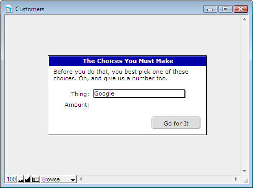
Have you ever built a pseudo-dialog-box in FileMaker? You know the kind: a layout that takes over the database window and forces the user to make some choices before they get back to your *normal* layouts. A lot of people like to make these things visually distinct by putting them inside a box, something like this:
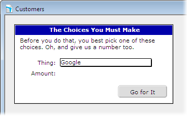
Now be honest with yourself. Every time you’ve done this, you’ve *wished* you could put the thing in the *middle* of the window. Unfortunately, since you don’t know how big the window will be, you can’t.
It isn’t entirely obvious at first, but with autoresize in FileMaker 9, you can. If you *turn off all the anchors*, FileMaker splits the difference as a window resizes. If it gets 100 pixels wider, the object moves 50 pixels, so that half the new space is on one side, and half is on the other.
So an object that is centered on the layout in layout mode, and has no anchors, will be centered on any size window. I’ll prove it:
## Two Ways to Resize Portals
Finally, you may have a portal that grows vertically thanks to autoresize. When you do, you’ll probably wonder which of these will happen:
– As the window gets bigger, the portal does too, and it can show more rows.
– As the window gets bigger, each portal row does too. The number of rows stays the same.
In fact, a perfectly reasonable developer might *want* either one. Sometimes a bigger window means you want to show *more* information about each item in the portal: bigger thumbnail images, larger notes fields, and so forth.
But it is probably more likely that you want more rows. After all, most portals just show tables of simple data, where extra height isn’t helpful. And seeing more related records is always nice.
It turns out FileMaker 9 can facilitate both needs. Here’s the scoop:
– If the *portal* is anchored to the top and bottom, but everything *on the portal* is just anchored to the top, then the portal will get new rows as it grows.
– If, on the other hand, a growing portal contains any item (it only takes one) that is anchored on the bottom, then the portal rows themselves will grow so the downward-moving item doesn’t leave its row.
>The item can be anchored on the top *and* the bottom if you want. You just need at least one item that is at least bottom anchored to get growing rows.
Now you know more than you ever wanted to about FileMaker Pro 9’s autoresize feature. Let us know if you discover any cool tricks of your own.
Excellent commentory, still on FMP v8 Pro Advanced, skipped 8.5 as I expected 9 this year and when I get an FMP upgrade I seem to spend hours on workarounds to solve shorcomings of latest release. V9 seems worthy of an upgrade. I Like the web site and plain, easy to understand talk. First visit and article – look forward to my next visit. Have Booked marked site.
@steve: Thanks for your kind words. We look forward to seeing you again soon 🙂
Geoff, you may not have realised that auto-resize can be very handy on print layouts. Imagine a print layout that automatically adjusts for either portrait or landscape automatically.
It works and depending on the content of your layout, can look really neat.
Cheers,
Nick
@nick: excellent point. I hadn’t thought of that. Have you tried it out? Very very interesting. Thanks!
Geoff
Geoff, I’m a first-timer on your site, too, and it’s really very well done! Your tips are right to the point and quite informative. But I see a number of them that require a password to obtain access, so I’m wondering what that procedure is.
Gotta say, though, that it makes no sense to me whatsoever that by locking both the top and bottom of a portal, increasing a window’s vertical size increases the number of rows (all objects inside locked only on the top). Has to be one of FMP’s greatest behind-the-scenes workarounds!! 🙂
@bart: I suspect jesse answered your question about the locked post. It will be unlocked soon. (No secrets here…it just wasn’t quite ready).
And I agree, the portal thing is not at all intuitive. I suppose something like a check box in the Portal Setup dialog box would have been too pedestrian 🙂
Geoff
Geoff: To me, Auto Resize was the most interesting feature of 9 but the FileMaker help files were too basic to really appreciate how this feature works. Thank you for breaking it down into manageable chunks for personal experimentation. You have provided an excellent roadmap to try and see if FileMaker can act like most other applications and change size with the size of different monitors. The key seems to be to Think Small and work up from there. That may be easier said than done as I find the smaller layouts on the bigger monitors are very hard to accurately guage spacing and font sizing but it is going to be the only way.
Great website. I arrived on the link from Matt at ISO.
@bruce: Thanks you so much for the compliments. And thanks (again) to Matt for the link 🙂
Be careful when electing to resize fields within the portal as they will overlap the others in the row. In cases where you’d like to have some expansion horizontally, it would make sense to me to only allow the right-most field to expand (say a description field or the like).
I have to say, I found this feature very disappointing. I have several clients who were looking forward to the ability to have layouts resize as they resized their windows, however, though you point out some interesting uses for this feature, this most crucial one doesn’t work, because all objects resize their edges with respect to a constant distance ot the window edge, and not with respect to their spacing on the layout. I was quite disappointed to set all the objects on a complicated layout to stretch with the window, and then once in browse mode resize the window, only to discover that the layout didn’t neatly resize as expected, but rather, each object “grew in place”, so they all overlapped, making the layout unreadable. I suppose if you wanted one comments field or portal to grow with the window, this is neat, but the minute you have more than one auto-resizing object you run the risk of expanded objects overlapping into unreadability as the window expands. Until we have the ability to group objects and have the whole group resize neatly as one, maintaining the original spacing proportions of the objects within them (as happens when you currently resize grouped objects in Layout mode,) I for one see this feature as of limited use.
Incidentally, with regard to putting psuedo-dialog boxes in small windows, FileMaker has built-in script steps that allow you to set the size and position of windows. (Although if your users for some reason insist on manually resizing those windows after they’re displayed, I say, that’s their problem.)
@michael: You’re absolutely right. It would be even more useful if it had some provision like you describe. But in my experience, I have been able to get good use out of the current less-than-perfect implementation.
In general, two elements that are in the same horizontal space can’t both grow horizontally. Same for vertically placed element. But it is pretty common to have some element that needs the space more than any other. As was mentioned in a previous comment, the limitation is most noticeable with columns of data, where only one column can grow horizontally.
Here’s hoping for even more power in 10 🙂
As for pseudo dialog boxes, on Mac OS X, you’re right again. But most developers on Windows find it necessary to keep their windows maximized. Otherwise you loose tons of screen real-estate to the odd window-within-a-window thing Microsoft cursed us with. When I’m doing mac-only work (which is rare) I carefully control my window sizes. But for cross platform work, I prefer maximized windows with centered dialog information on MS Windows. Luckily, with 9, you can make a layout that looks good as a real pop-up window on Mac, and a maximized window with centered content on Windows.
I am trying to use auto resize in printing (as mentioned briefly). I have a document/report that has merge fields that (depending on the record) could be 3 pages or 6 pages. How do i set it to not print 3 blank pages when it shrinks or cut off text when it needs to expand?
@kendall:
Auto Resize won’t help you there. Instead, set your merge fields (and everything below them) to slide up in the Format -> Set Sliding/Printing dialog box. Also turn on “Also reduce the size of the enclosing part.” With these in place, it should stop printing blank pages.
Geoff
Where do I turn on -“Also reduce the size of the enclosing part.” ?
@Kendall:
Same place, in the dialog box that pops up when you choose Format -> Set Sliding/Printing. Once you turn on the “Sliding up” checkbox, you will be able to turn on “Also reduce the size of the enclosing part” as well.
Geoff
That worked – thanks. I uprgaded to 9 so I could take care of the problem with auto resize and when it didn’t work &8##!. Thanks again.
When I switched the contact database I made in FMP 8.5 Adv to FMP 9 Adv AND THEN moved up to LEOPARD, I started having major issues with the command “Resize to fit window” in my scripts.
Is this why? How can I fix it? Now, instead of going from a bigger layout back to the smaller layout, it keeps the window large and scrolls half way down, which is really crazy and confusing looking. What happened?
PS In case my last post wasn’t clear, there’s no user making the window bigger or smaller manually.
I had written script steps in resize the window when you push a button that takes you from one large, long layout (a list of results) to a smaller, individual entry view layout.
The button says: “Go to Individual Entry View.”
In FMP 9 Adv in Leopard (Mac OS 10.5.4) it doesn’t resize the window — it leaves it big and even moves the scroll bar half way down.
This is a complete mystery to me. Any advice?
@Carey:
That is definitely not the expected behavior with or without auto-resize. It should behave just like before. Are you sure your Individual Entry layout is set to Form View and not List View?
Geoff
Geoff, You’re a genius. It was set to List View. Thank you, thank you for your help!
Carey
Well, I have tried just about every little anchor in every combination and I still cannot get the fields to resize. They remain exactly the size they are in the layout. I am at a loss. I have a groovy little report just chock full of good information that remains hidden. I am using #9 on a mac w/leopard. Megan
@Megan:
Do you have other things on the layout that make it very large? Object will only resize when the window size gets bigger than the rectangle encompassing every item in layout mode. So if you have some stuff way off to the side, or a very tall body part, or both, you won’t see any resizing because FileMaker thinks it can’t fit everything in.
Geoff
Perhaps I do not understand resizing and sliding. If I have a field of information in a report that is three paragraphs in one set and two paragraphs in another, file maker decides it cannot fit it in on the page, do I just lengthen the page so that I have an endless number of pages? Or do I have to make the fields in the report large enough to cover any size of field? All I want this report to do is to show all the information regarding each item. I can take ten pages but the reader has to be able to read it. megan
Freakin great! Just a couple of clicks and this tip is beautiful!
I hadn’t even given a thought to autoresize before this. It’s now number one on my layout list. Thanks much!
I want a layout with two web viewers side by side. When you make the layout bigger or smaller, the two webviewer go bigger or smaller but the left one is always the left 50% and the right is always the right 50%. Think of an open book with a left and right page. If you try to anchor all sides then they overlap in the middle. If you anchor no sides the WVs stay centered T to B and L to R but don’t get bigger/smaller. Solution?
Chris:
I don’t think there’s a way to do it, unfortunately. You can get this effect top-to-bottom by putting things in a two-row dummy portal, but I know of no trick for side-by-side.
Let me know if you find a way.
Geoff
I have a related question… I am trying to created a print layout that has four columns. Two of the four columns can have 1 entry or 12 entries. Is there a way to “auto-size” the font size so that if all the text cannot fit in the field (actually it a string of merged fields at this point), then the font size will decrease until it can all fit? And in addition if there are only a few rows then make/keep the font size 12pt for instance. I am thinking this would have to done in a script.
-Supplemental info: I have 20 main records with an ID, a tiltle, the owner etc. and also within each record there is an “Approach” field and a “Status” field. Those “fields are actually related tables and have multiple entries that show up on the print layout. Each record is takes up one page (it’s projected for a presentation).
-Currently for instance my Status table (linked by ID) has status_entry1, status_entry2 etc. – So I have text field with a string of merged tags (<> <> etc. – I am now thinking it might be better to use a portal instead. Which would mean that I would have to have chage my status table so that there is an ID and status field. Then I could use a portal. Woud that make auto text resizing any easier?
Thanks in advance!
Steve
Hi Geoff,
Thanks so much!
I noticed the new FM10 Templates actually utilize this featue, and then went to finally figure it out. So I googled it, and up came your fine article. Thanks again.
One question, are there any enhancements in FM10 beyond your fine article?